







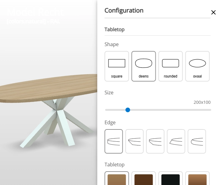
A table quickly runs to dozens of combinations: shape, size, edge, tabletop colour and base colour. In an ordinary online store, a customer has to guess which combination is possible, or ask customer service. How do you show that many choices without the customer losing track?
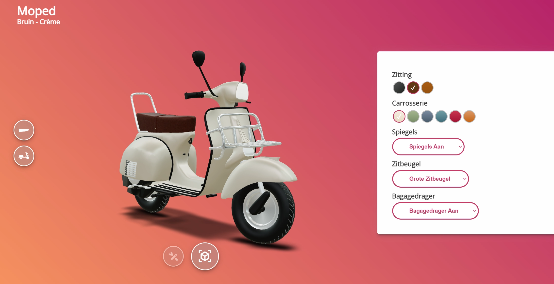
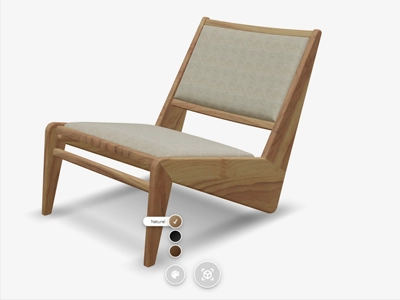
With the new sidebar. Every option sits in a panel next to the 3D model, and every choice shows up on the product straight away.
A place for every option
In the sidebar, each option gets a place of its own. For each one, you decide how it is shown:
- Buttons, for the shape of a tabletop, for instance.
- Sliders, for a size that goes up in steps.
- Dropdown menus, when there are a lot of choices.
- Images, for a colour, a material or an edge finish.
If a product has many options, you spread them over tabs and headings. That keeps things clear for the customer, even for a product with dozens of variants.
Shown in 3D straight away
Every choice in the sidebar is applied to the 3D model at once, without reloading the page. The customer turns the result around, looks at it from every side and sees exactly what they are ordering. With AR, they can then place the finished table at full size in their own dining room.
In your own house style
Everything in the sidebar can be styled: colours, fonts, spacing and animations. That way the configurator feels like part of your own store. A URL parameter sets whether the sidebar sits to the left or right of the product, and you manage the options yourself in the Vulp dashboard, after launch too, without a developer.
Choices back into your order process
What the customer puts together, you read out through the Vulp API. That way the chosen configuration ends up in your cart, your order process or your PIM system.
On the sidebar configurator page, you can put together a dining table yourself.